Our Digital Marketing Blog
Case studies and success stories, plus digital marketing news and updates
JOIN NEWSLETTER
Join our Newsletter
SHARE THE BLOG
AI Search is changing how SEO is measured. Here’s why rankings, brand mentions, citations, content quality, and trust still matter.
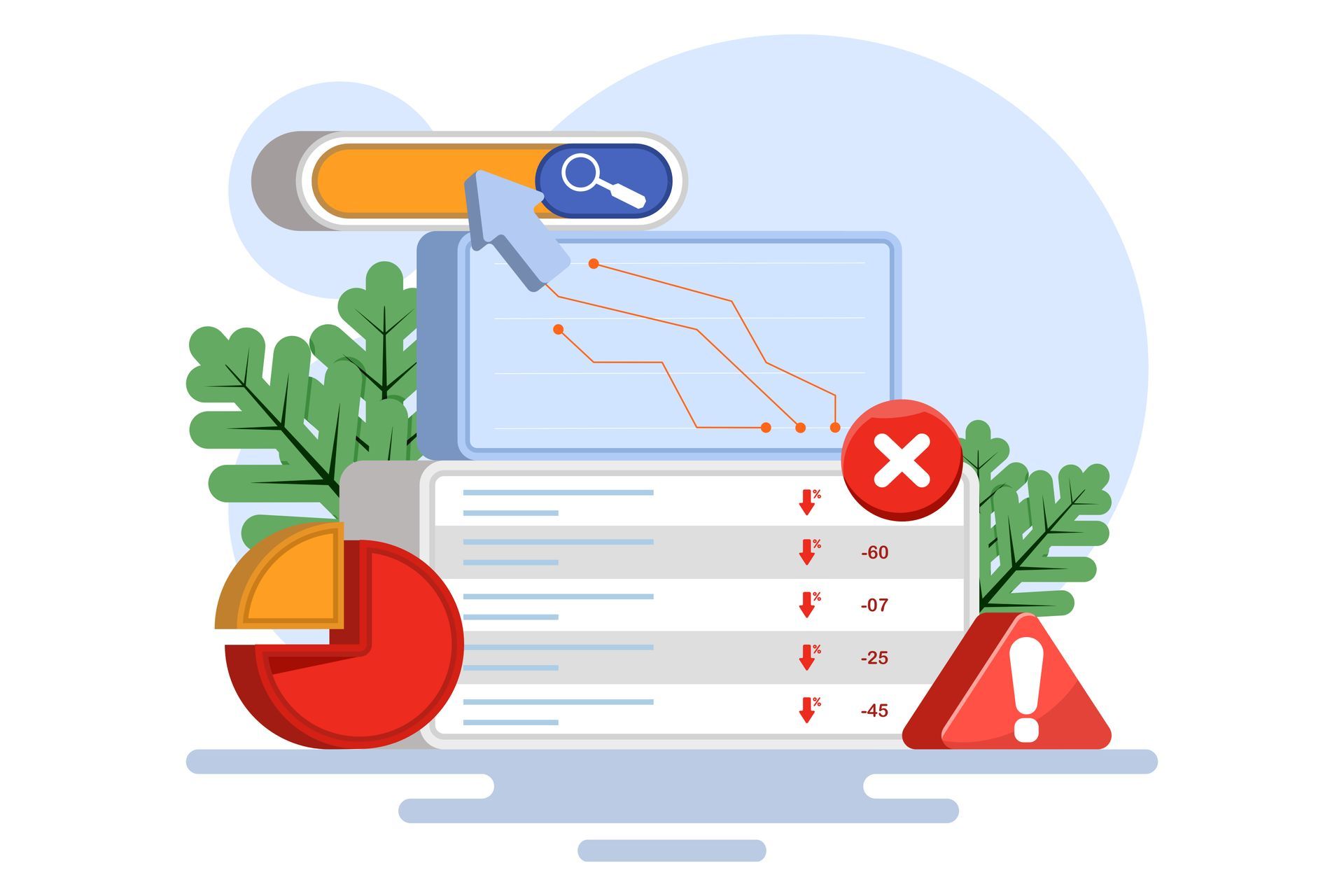
Find out why your SEO is not getting results and how to fix weak content, technical issues, low authority, poor strategy, and missed leads.
Email marketing & social media each play distinct roles in the customer journey. Learn how they differ and how they work together to create stronger results.

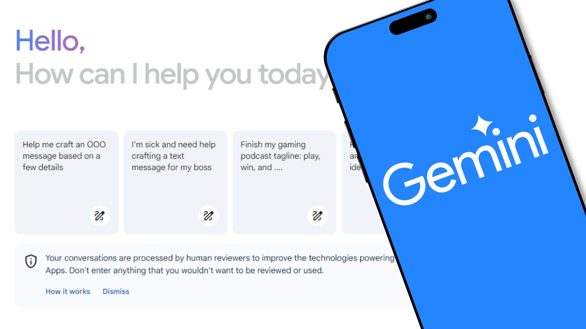
AI is changing how brands get discovered online. Here’s what I’m watching in SEO, reviews, content quality, and AI visibility, and what it means for businesses.

AI can help support content creation, but it is not a replacement for quality, originality, and strategy. Here’s why mass AI content is the wrong approach.

Technical, on-page, and off-page SEO influence how websites rank in search results. Learn how these three SEO pillars work together to drive organic growth.

Learn how the local search algorithm works and how businesses can improve map pack visibility. In this guide, we break down the key components.
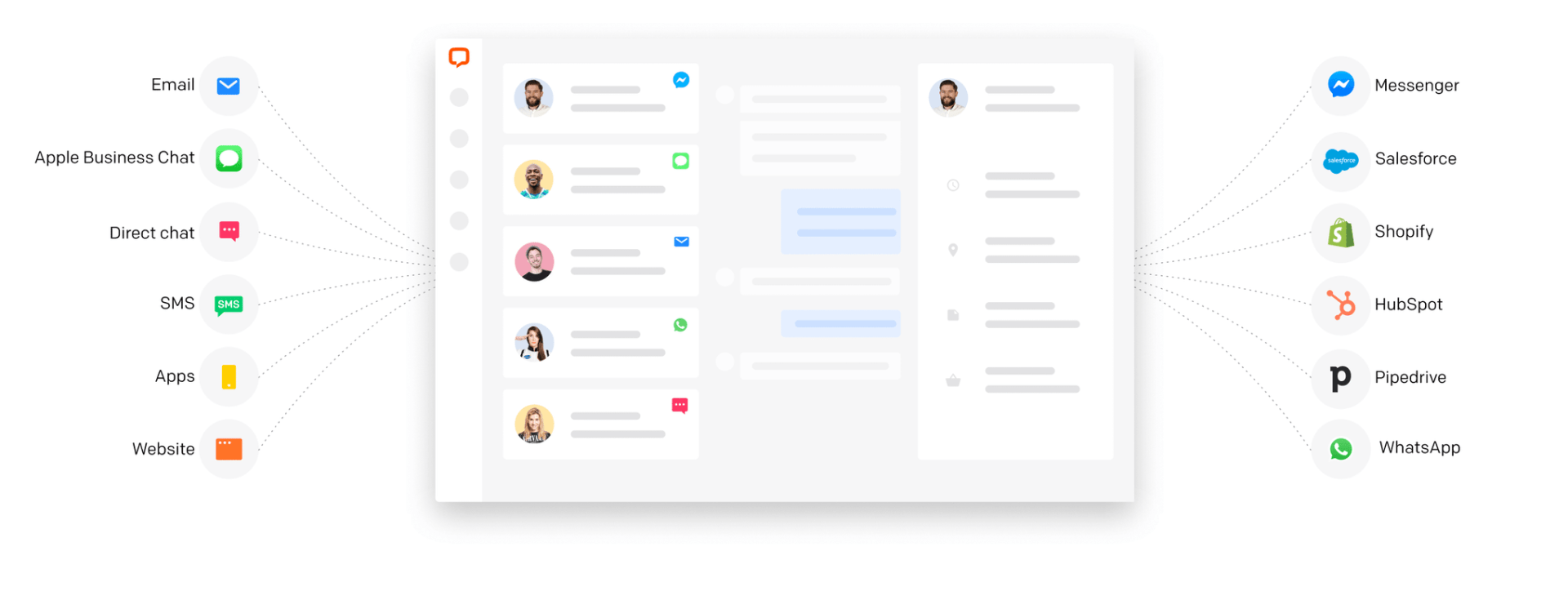
Learn how Text helps businesses streamline engagement marketing with live chat, AI chatbots, and integrated support tools backed by CCC expertise.
A smartphone displaying the ChatGPT interface is held up in front of the ChatGPT logo on a purple and white gradient background.