By Conscious Commerce
•
May 7, 2025
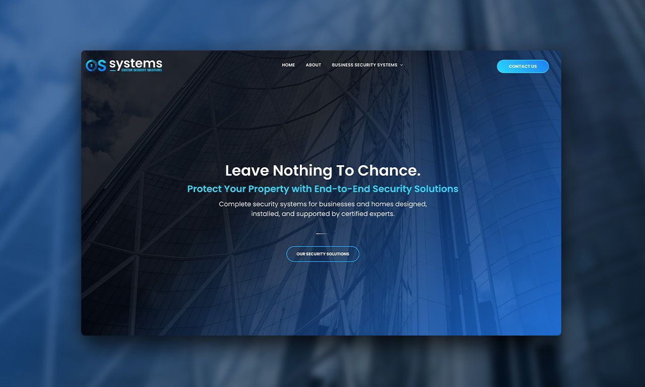
OS Systems Ltd. came to us with the goal of updating their brand to reflect who they are today. Their old branding lacked cohesion, depth, and a strong identity and their digital presence especially the website, wasn’t telling the right story. Branding Direction To help reach this goal we set out to create a bold but approachable brand that clearly communicated professionalism, innovation, and trust. The new identity started with a new logo: a stylized “O” embedded with wiring, circuitry, and a lock icon. This not only made the logo recognizable, but also reinforced OS Systems’ role in delivering smart, integrated security solutions. To support the new look, we introduced: A tech-forward iconography set A colour palette built around blues and teals (trust, safety, innovation) Clear, confident typography using Poppins for body and Oswald for the tagline A refreshed brand statement: Custom Security Solutions, summarizing their commitment to personalized, high-tech protection


