Company Update April 2020
Brandon Klayman • April 30, 2020

All of us at CCC care about the wellbeing of our clients and partners during these difficult times. As the situation around us evolves with each passing day, we consider ourselves fortunate to be able to continue working alongside our clients.
As for our clients in the medical and wellness industries, we are grateful for the commitment you have shown since the beginning of this crisis. As businesses across the globe are forced to adapt in the face of uncertainty, CCC remains committed to seeing our clients thrive by easing their digital transition.
While we grapple with the day-to-day challenges of pandemic life, here at CCC, we’ve set aside some time to take a step back and self-contemplate. In partnership with our dear client Cindy Smith AEP, we invite you to join us in these daily meditation sessions.
It is my sincere hope that we can all stay safe and connected to our loved ones in the coming weeks and months. Given the rapidly shifting landscape in which we now find ourselves, we encourage you to use this time to explore new ideas and to focus on innovation.
Brandon Klayman, President, CCC.
This article was written by Conscious Commerce Corporation Founder & CEO Brandon Klayman with the help of lead copywriter Eric Carriere.

Lock in 15% savings for life on any Robly email marketing subscription. This exclusive offer ensures you get top-notch email marketing tools at an unbeatable value, helping your business connect with audiences while keeping costs down. Book a complimentary consultation to get started!

Optimize your Google Business Profile to boost local search visibility on Google Search and Maps. Learn key features, SEO benefits, and best practices.
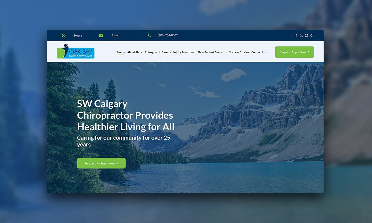
We recently completed a website migration for Oak Bay Family Chiropractic Centre , moving them from Perfect Patients to MAP Web . Along with the migration, we gave their site a fresh, modern look with a cleaner layout and clearer navigation to make it easier for visitors to find what they need. The services were reorganized to better highlight what they offer, and stronger calls-to-action were added to encourage bookings and inquiries. We also improved mobile responsiveness so the site works smoothly on any device. The new site is easier for Oak Bay Family Chiropractic Centre to manage internally and reflects their brand more consistently with updated colours, fonts, and design elements.
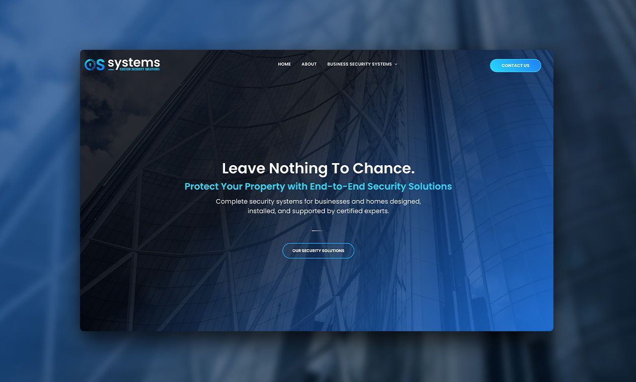
OS Systems Ltd. came to us with the goal of updating their brand to reflect who they are today. Their old branding lacked cohesion, depth, and a strong identity and their digital presence especially the website, wasn’t telling the right story. Branding Direction To help reach this goal we set out to create a bold but approachable brand that clearly communicated professionalism, innovation, and trust. The new identity started with a new logo: a stylized “O” embedded with wiring, circuitry, and a lock icon. This not only made the logo recognizable, but also reinforced OS Systems’ role in delivering smart, integrated security solutions. To support the new look, we introduced: A tech-forward iconography set A colour palette built around blues and teals (trust, safety, innovation) Clear, confident typography using Poppins for body and Oswald for the tagline A refreshed brand statement: Custom Security Solutions, summarizing their commitment to personalized, high-tech protection

Explore how AI technologies like ChatGPT and Microsoft Copilot are transforming business operations, enhancing productivity, and the ethical considerations involved.
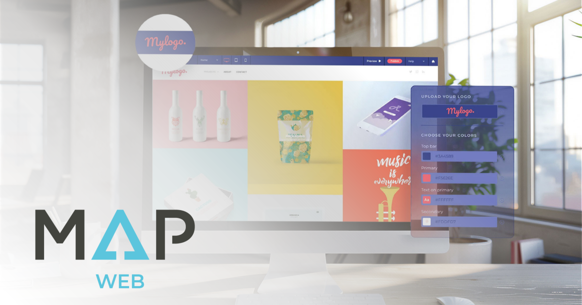
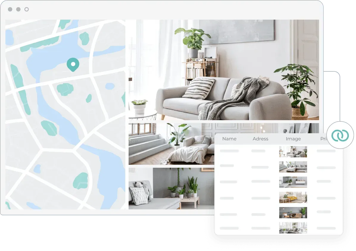
Meet MAP Web, the cornerstone of the MAP Platform, offering an intuitive, no-code website builder that empowers businesses to create stunning, responsive, and SEO-optimized websites.
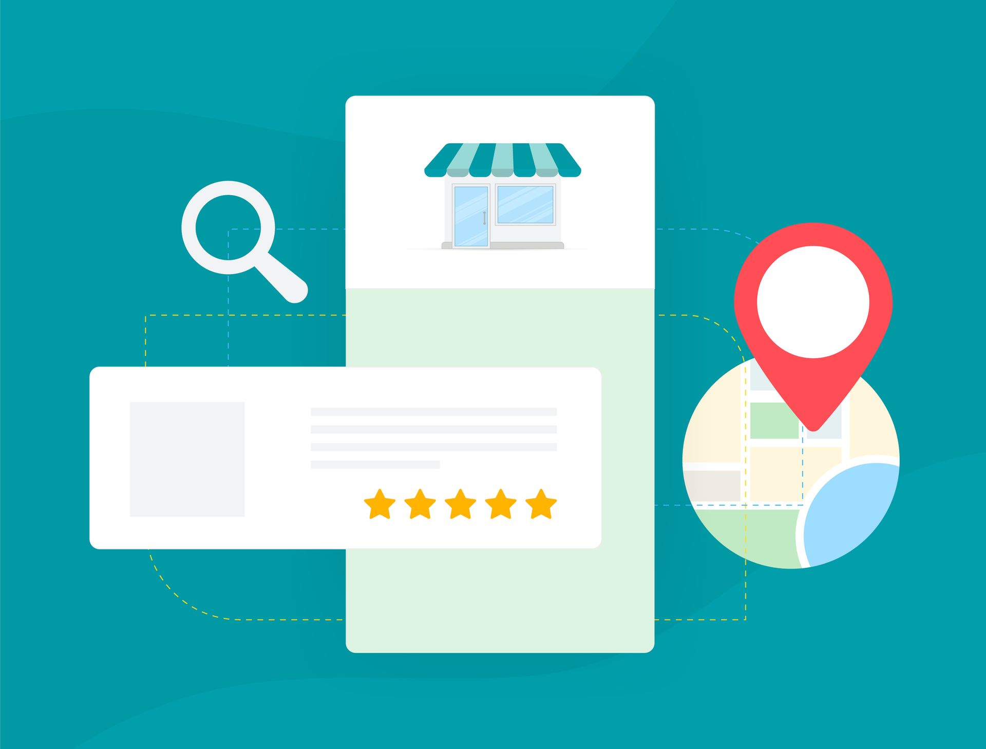
Discover what local SEO is, why it matters for businesses, and how to adapt to Google’s updates to stay visible, attract customers, and grow locally.
Can you believe we are already 25% done 2025? Check out what our clients have achieved so far, and prepare for local SEO insights.
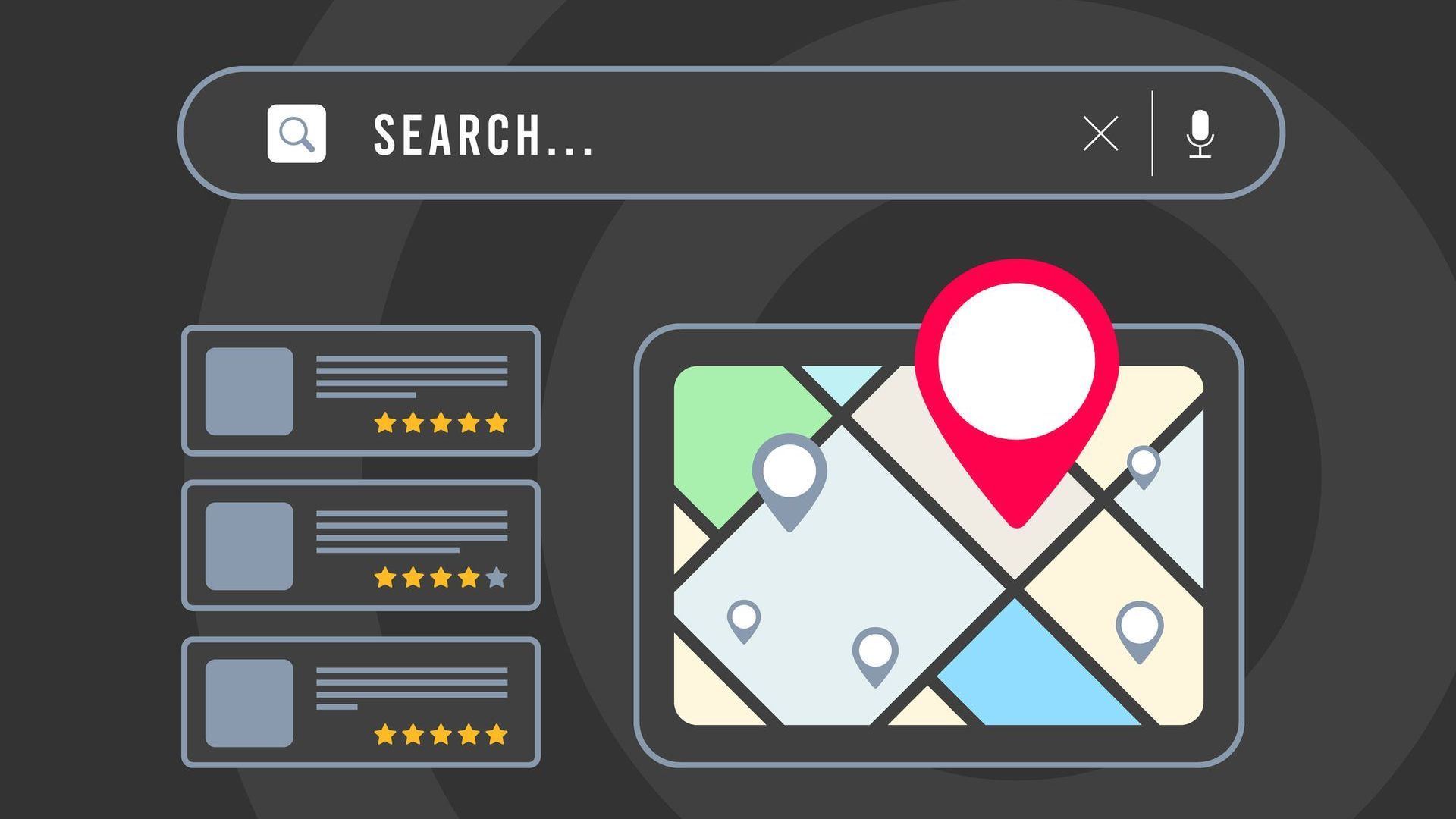
Learn why local SEO is important. Discover 9 benefits from better visibility to higher sales and stand out in your community’s and/or cities' search results.
MAP Web is a powerful tool that is constantly growing and evolving. Check out CCC's favourite features and book your account review to maximize your website's potential.