Phoenix Metals Ltd. Logo: A Representation of Rebirth, Strength, and Resilience
Conscious Commerce • November 19, 2020
CCC designed a powerful and striking logo for Phoenix Metals Ltd., capturing the essence of rebirth and strength through the iconic phoenix symbol. The fiery gradient of orange and red in the phoenix’s wings represents transformation and resilience, aligning perfectly with the company's mission in the metal industry. The bold black lettering of the company name contrasts sharply against the vivid imagery, ensuring a professional and memorable brand presence. This logo not only reflects the core values of Phoenix Metals but also stands out as a dynamic representation of their commitment to quality and durability.
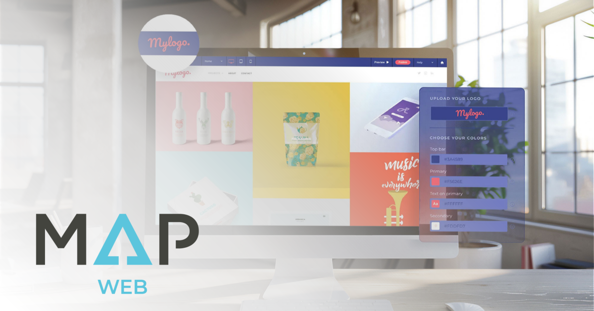
Meet MAP Web, the cornerstone of the MAP Platform, offering an intuitive, no-code website builder that empowers businesses to create stunning, responsive, and SEO-optimized websites.

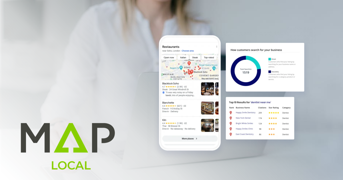
Discover what local SEO is, why it matters for businesses, and how to adapt to Google’s updates to stay visible, attract customers, and grow locally.
Get a Free SEO Audit, a $500 value, when you subscribe to MAP Local *
Can you believe we are already 25% done 2025? Check out what our clients have achieved so far, and prepare for local SEO insights.

Learn why local SEO is important. Discover 9 benefits from better visibility to higher sales and stand out in your community’s and/or cities' search results.
MAP Web is a powerful tool that is constantly growing and evolving. Check out CCC's favourite features and book your account review to maximize your website's potential.
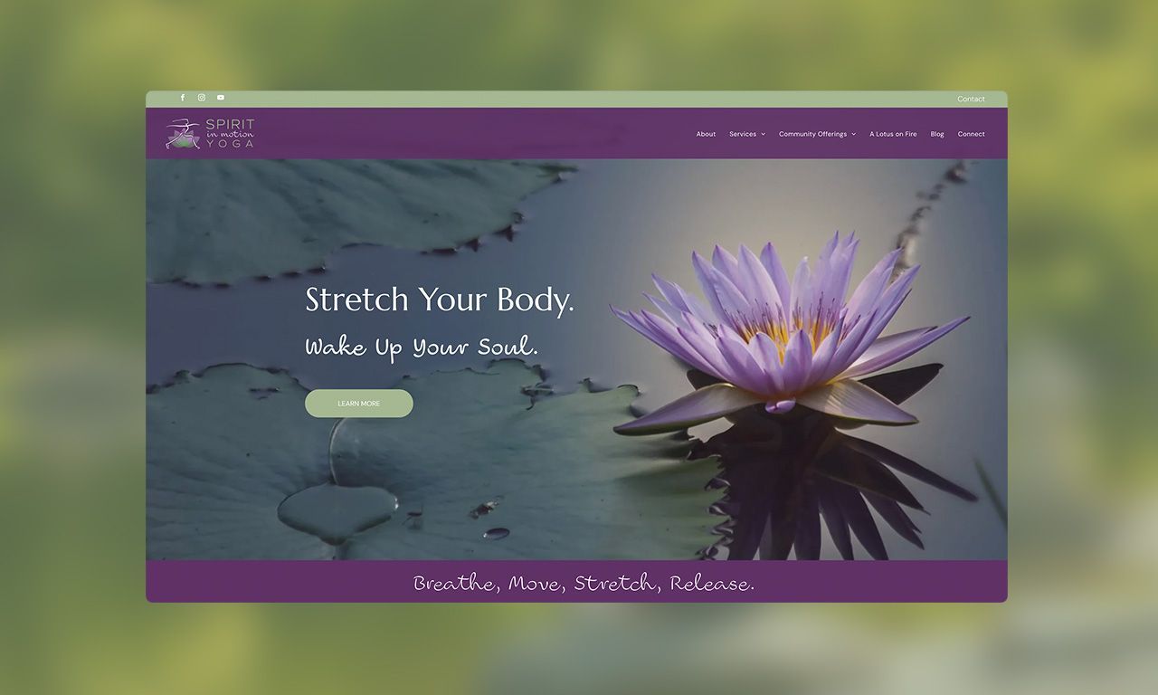
Conscious Commerce Corporation collaborated with Vickie MacArthur to refresh and unify the Spirit in Motion Yoga brand, creating a cohesive online presence that bridges her personal and professional identities.
Dive into this month's MAP Platform updates featuring MAP Web & MAP Social

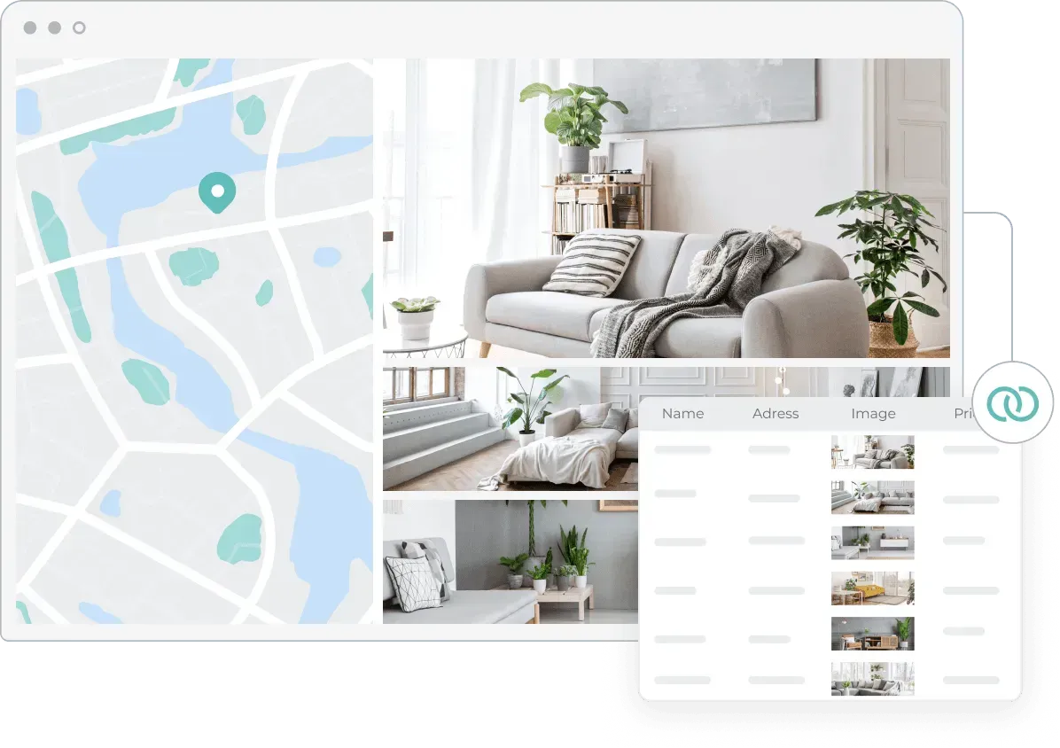
Discover how an automated sitemap generator boosts SEO by ensuring complete indexing, real-time updates, and a seamless user experience.
Blog Management Updates You can now delete or unpublish multiple posts at once, streamlining blog management. Additionally, publish dates will match your site’s default language format, enhancing user experience and creating a more localized feel for visitors.